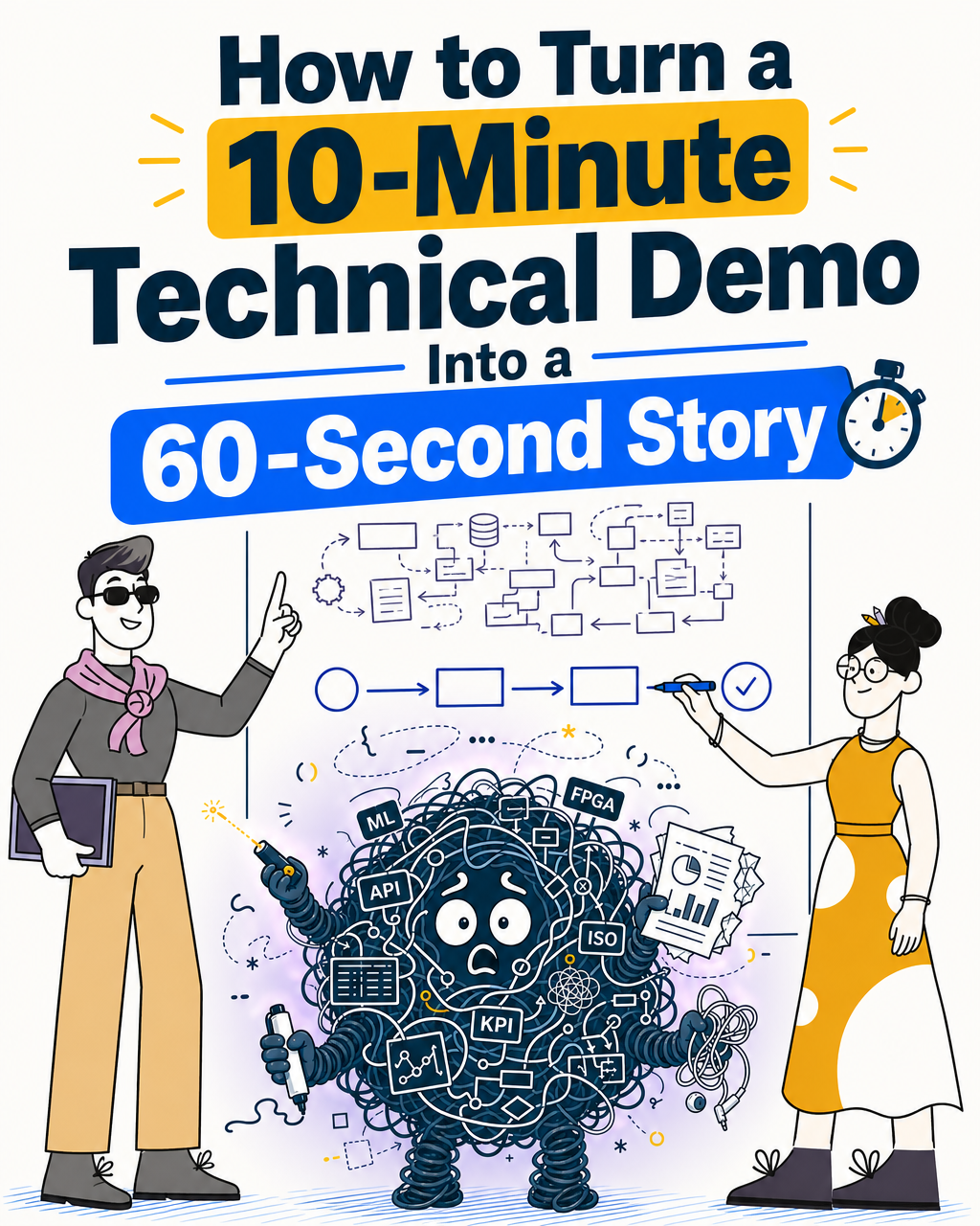
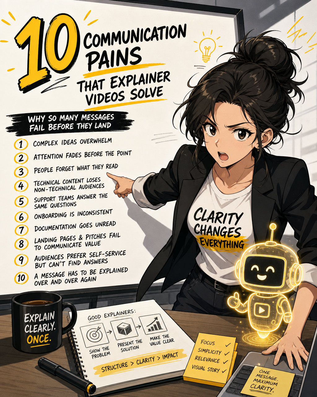
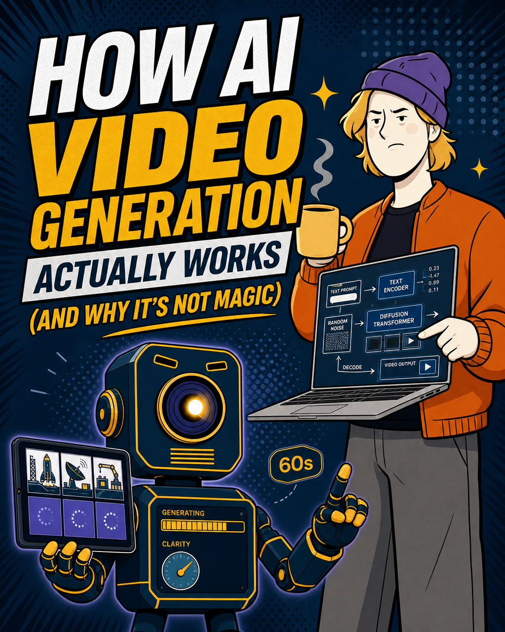
10 Tips for a Great Explainer Video (That Actually Works)
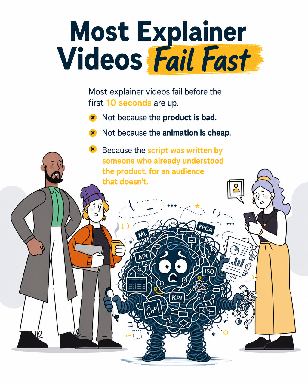

Most explainer videos fail before the first 10 seconds are up. Not because the product is bad. Not because the animation is cheap. Because the script was written by someone who already understood the product, for an audience that doesn't.
If you're a founder preparing for a raise, a CMO trying to open enterprise doors, or an IR lead with a quarterly deadline bearing down, your explainer video is doing real commercial work. It's the asset that either makes the product click, or sends your audience back to Google.
Here's what separates one from the other.
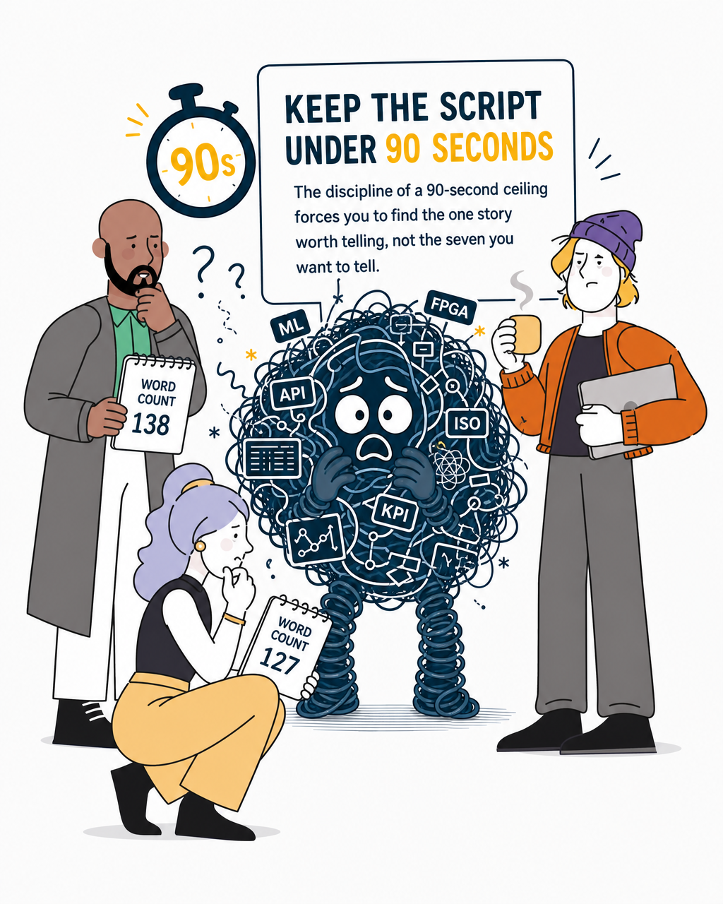
1. Keep the script under 90 seconds
This is the single rule most teams break, and it costs them more than they realise.
Shorter videos tend to retain more viewers, and retention typically drops after the two-minute mark — though for warm investor audiences or product demos where the viewer has opted in, longer formats can outperform short ones. For top-of-funnel and cold audiences, 90 seconds remains a useful default discipline.
For a deep tech product, 90 seconds feels impossibly short. That's the point. The discipline of a 90-second ceiling forces you to find the one story worth telling, not the seven you want to tell. Most voiceover artists read at 120–150 words per minute at a natural pace; aim for 120–140 words for a comfortable 60-second script that allows for pauses. Budget roughly 20–25 seconds per key point — at that pace, a 90-second video holds a maximum of three to four points, which is already two or three more than most viewers will retain. If it won't fit, you haven't made the decisions yet.
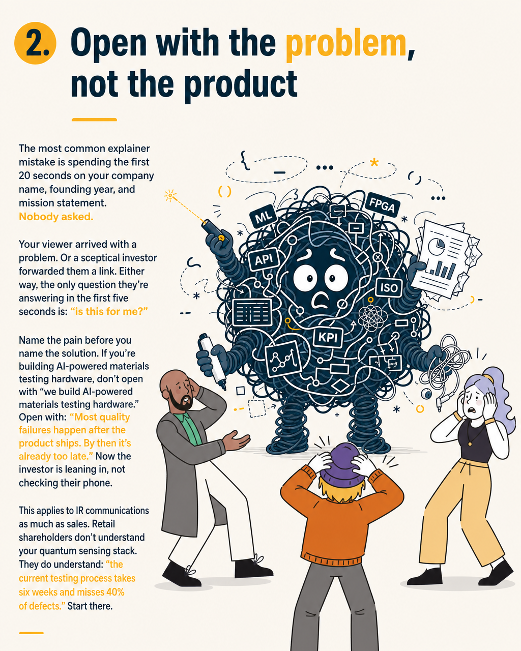
2. Open with the problem, not the product
The most common explainer mistake is spending the first 20 seconds on your company name, founding year, and mission statement. Nobody asked.
Your viewer arrived with a problem. Or a sceptical investor forwarded them a link. Either way, the only question they're answering in the first five seconds is: "is this for me?"
Name the pain before you name the solution. If you're building AI-powered materials testing hardware, don't open with "we build AI-powered materials testing hardware." Open with: "Most quality failures happen after the product ships. By then it's already too late." Now the investor is leaning in, not checking their phone.
This applies to IR communications as much as sales. Retail shareholders don't understand your quantum sensing stack. They do understand: "the current testing process takes six weeks and misses 40% of defects." Start there.
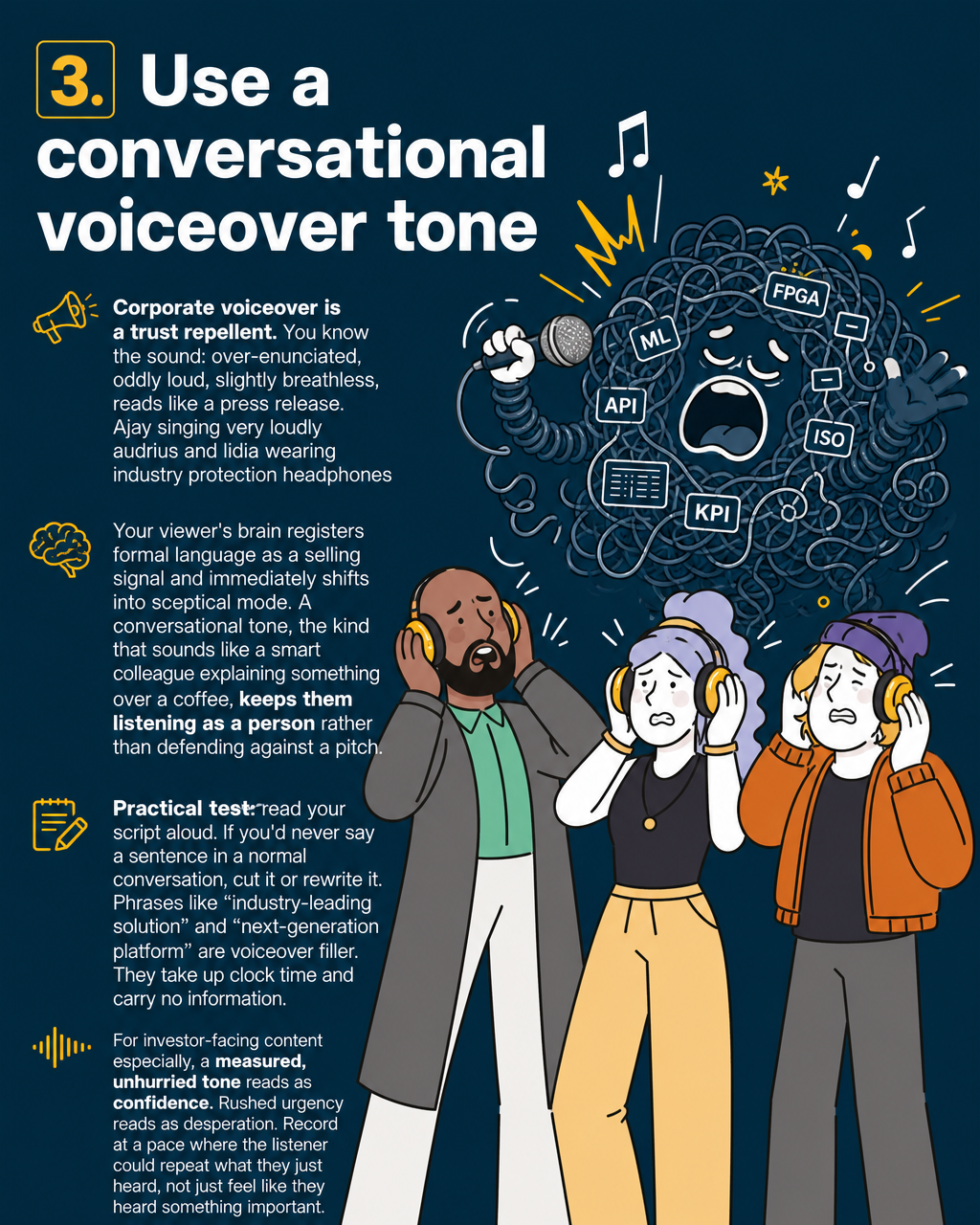
3. Use a conversational voiceover tone
Corporate voiceover is a trust repellent. You know the sound: over-enunciated, oddly loud, slightly breathless, reads like a press release.
Your viewer's brain registers formal language as a selling signal and immediately shifts into sceptical mode. A conversational tone, the kind that sounds like a smart colleague explaining something over a coffee, keeps them listening as a person rather than defending against a pitch.
Practical test: read your script aloud. If you'd never say a sentence in a normal conversation, cut it or rewrite it. Phrases like "industry-leading solution" and "next-generation platform" are voiceover filler. They take up clock time and carry no information.
For investor-facing content especially, a measured, unhurried tone reads as confidence. Rushed urgency reads as desperation. Record at a pace where the listener could repeat what they just heard, not just feel like they heard something important.
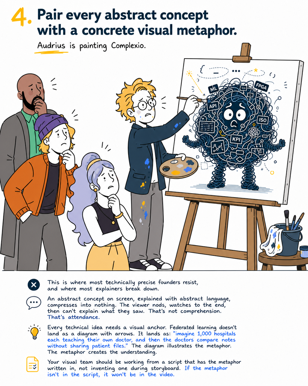
4. Pair every abstract concept with a concrete visual metaphor
This is where most technically precise founders resist, and where most explainers break down.
An abstract concept on screen, explained with abstract language, compresses into nothing. The viewer nods, watches to the end, then can't explain what they saw. That's not comprehension. That's attendance.
Every technical idea needs a visual anchor. Federated learning doesn't land as a diagram with arrows. It lands as: "imagine 1,000 hospitals each teaching their own doctor, and then the doctors compare notes without sharing patient files." The diagram illustrates the metaphor. The metaphor creates the understanding.
Your visual team should be working from a script that has the metaphor written in, not inventing one during storyboard. If the metaphor isn't in the script, it won't be in the video.
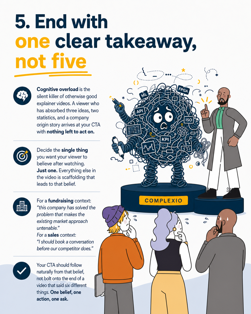
5. End with one clear takeaway, not five
Cognitive overload is the silent killer of otherwise good explainer videos. A viewer who has absorbed three ideas, two statistics, and a company origin story arrives at your CTA with nothing left to act on.
Decide the single thing you want your viewer to believe after watching. Just one. Everything else in the video is scaffolding that leads to that belief.
For a fundraising context: "this company has solved the problem that makes the existing market approach untenable." For a sales context: "I should book a conversation before our competitor does."
Your CTA should follow naturally from that belief, not bolt onto the end of a video that said six different things. One belief, one action, one ask.
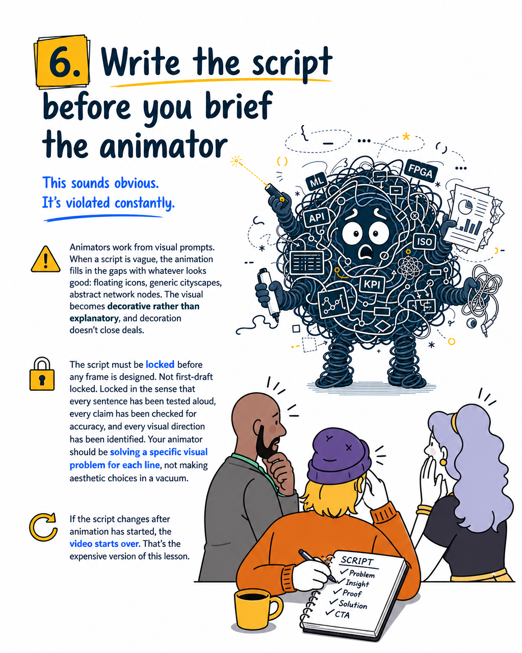
6. Write the script before you brief the animator
This sounds obvious. It's violated constantly.
Animators work from visual prompts. When a script is vague, the animation fills in the gaps with whatever looks good: floating icons, generic cityscapes, abstract network nodes. The visual becomes decorative rather than explanatory, and decoration doesn't close deals.
The script must be locked before any frame is designed. Not first-draft locked. Locked in the sense that every sentence has been tested aloud, every claim has been checked for accuracy, and every visual direction has been identified. Your animator should be solving a specific visual problem for each line, not making aesthetic choices in a vacuum.
If the script changes after animation has started, the video starts over. That's the expensive version of this lesson.
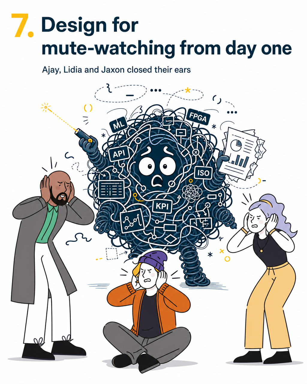
7. Design for mute-watching from day one
This one matters more than most production teams build for.
Sound-off viewing behaviour varies significantly by platform and context — social feeds, email embeds, and open-plan offices all default toward mute in ways that dedicated viewing sessions don't. For investor-facing video sent via email or shared on LinkedIn, a meaningful portion of first views may happen without audio. If your explainer relies entirely on voiceover to carry the narrative, a share of your audience is watching a silent film they can't follow.
Build captions in from the start, not as an afterthought. Use on-screen labels to reinforce key claims. Key numbers, the core product statement, and the CTA should all be readable without sound. Captions tend to improve completion rates, particularly in professional viewing contexts where sound-off is common.
This isn't just accessibility. It's basic distribution strategy.
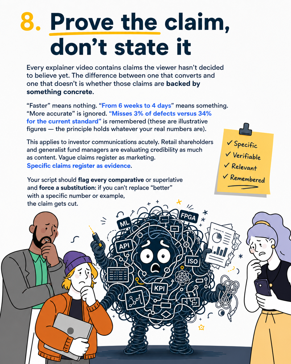
8. Prove the claim, don't state it
Every explainer video contains claims the viewer hasn't decided to believe yet. The difference between one that converts and one that doesn't is whether those claims are backed by something concrete.
"Faster" means nothing. "From 6 weeks to 4 days" means something. "More accurate" is ignored. "Misses 3% of defects versus 34% for the current standard" is remembered (these are illustrative figures — the principle holds whatever your real numbers are).
This applies to investor communications acutely. Retail shareholders and generalist fund managers are evaluating credibility as much as content. Vague claims register as marketing. Specific claims register as evidence.
Your script should flag every comparative or superlative and force a substitution: if you can't replace "better" with a specific number or example, the claim gets cut.
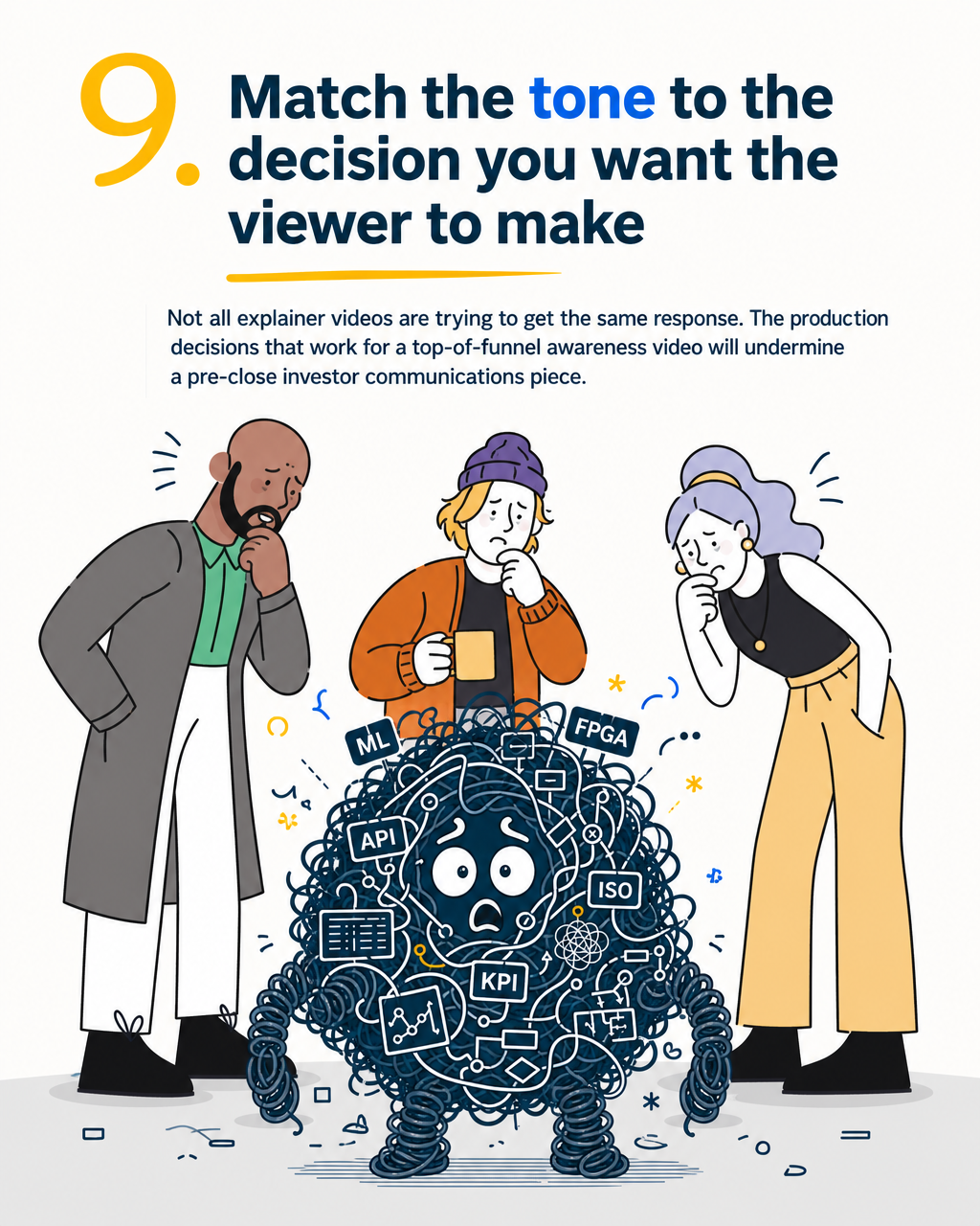
9. Match the tone to the decision you want the viewer to make
Not all explainer videos are trying to get the same response. The production decisions that work for a top-of-funnel awareness video will undermine a pre-close investor communications piece.
A fundraising explainer sent to a tier-one VC days before a term sheet conversation should feel considered, precise, and unhurried. The visual pacing, the voiceover delivery, and the narrative structure all signal credibility. Move too fast, and the viewer reads it as a pitch. Move too slow, and they check out.
An SDR-deployed top-of-funnel video needs a shorter hook window and a harder CTA. An IR video for retail shareholders needs plain language and no assumed context.
Before briefing your studio, write one sentence describing the decision you want the viewer to make, and the emotional state you want them to be in when they make it. Brief to that, not to the content list.
10. Produce it in the formats you'll actually deploy it in
This one is operational, but it kills more good videos than bad creative does.
A 16:9 master file is not a LinkedIn post. It's not a pitch deck embed. It's not an email thumbnail. If your production run doesn't include a 1:1 square, a 9:16 vertical, a captioned version, and a clean thumbnail frame, you'll arrive at pitch day with one format and a problem.
Every format gets used in a different context, by a viewer with a different level of readiness. The square is for LinkedIn, where your buyer first encounters the brand. The 16:9 is for the deck and the website. The 9:16 is for mobile-first playback. The captioned version is for every context where sound-off is the default.
Build the format matrix into the brief, not as a post-production add-on. Re-editing from a single master is expensive and usually results in a vertical crop that doesn't work.
One sentence, say it better
There's a useful test you can run before greenlighting any explainer script. Send the video to three people in your target audience who haven't seen your product before. Ask them one question afterward: "in your own words, what does this product do?"
If the answers diverge significantly, or if they replay the concepts you wanted them to replay but can't articulate the central idea, the video isn't done yet. Comprehension is the receipt. Everything else is production.
A good explainer isn't the one that looks impressive in the edit. It's the one where the viewer, having watched, could explain your product to someone else without prompting.
That's the standard worth building to.
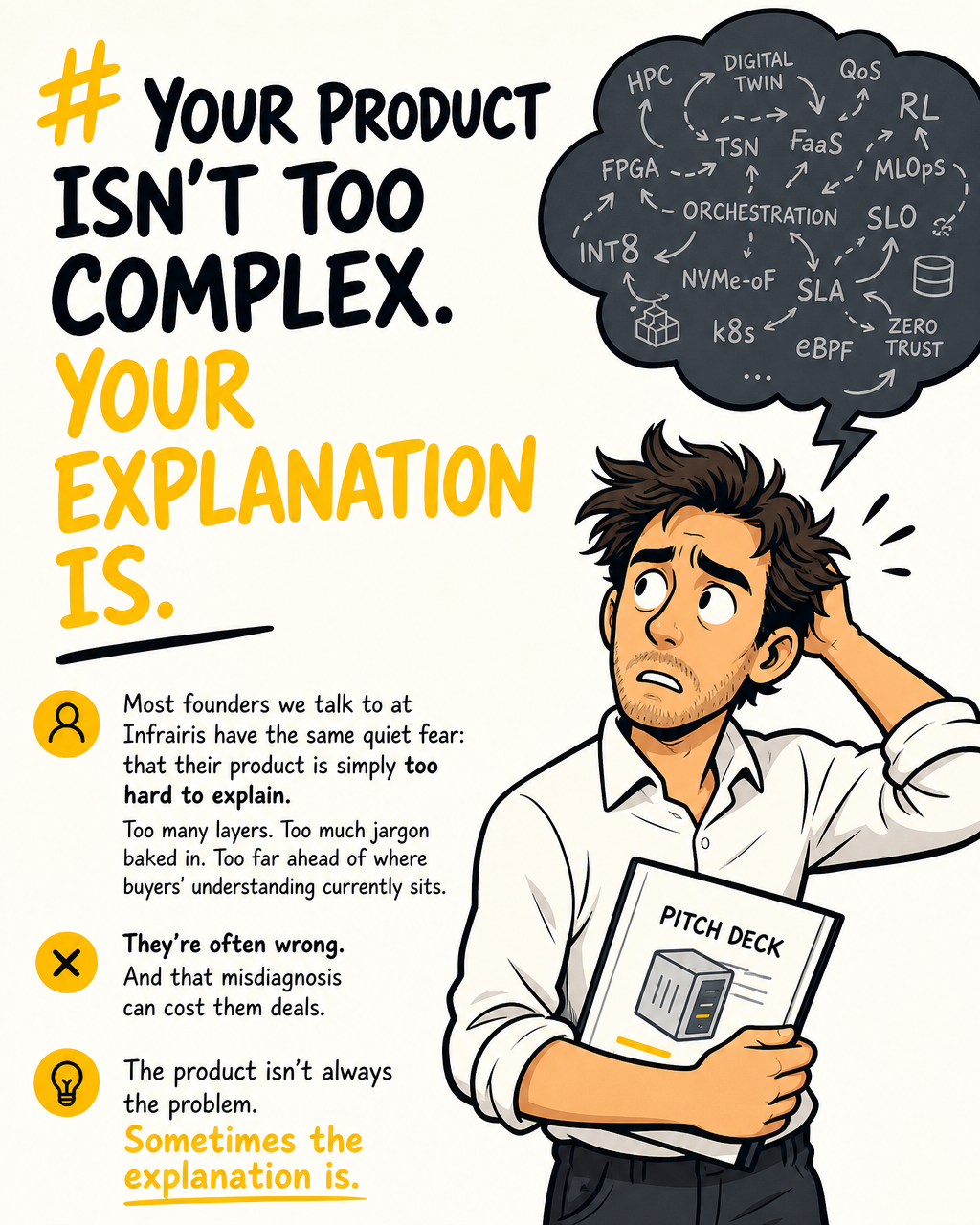
Infrairis is an agentic explainer studio for ANZ tech companies whose biggest growth bottleneck is comprehension. We deliver 60-second explainers in 2–3 weeks from brief sign-off, subject to timely client feedback. Our direction is informed by first-hand experience building and launching tech products. If you're preparing for a raise, refreshing your sales deck, or facing an IR deadline, start here.
Infrairis
Your complex product. In 60 seconds. Clearly.
Your complex product. In 60 seconds. Clearly.
Learn more about Infrairis and get started today.
Visit Infrairis